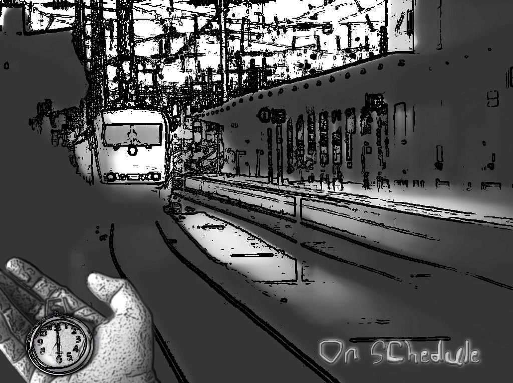
No matter how complex the problem, there remains a solution. Sometimes the solutions are within our grasp, sometimes they are not.

Wednesday, May 24, 2006

Name Branded Jeans

Tuesday, May 23, 2006

"On Schedule" : Pixel_pounce_Black & White

Wednesday, May 10, 2006

Weekly_Challenge_#3


This challenge featured a bunch of grapes on the vine, and a plasma lamp.

Readers' Challenge Entry's

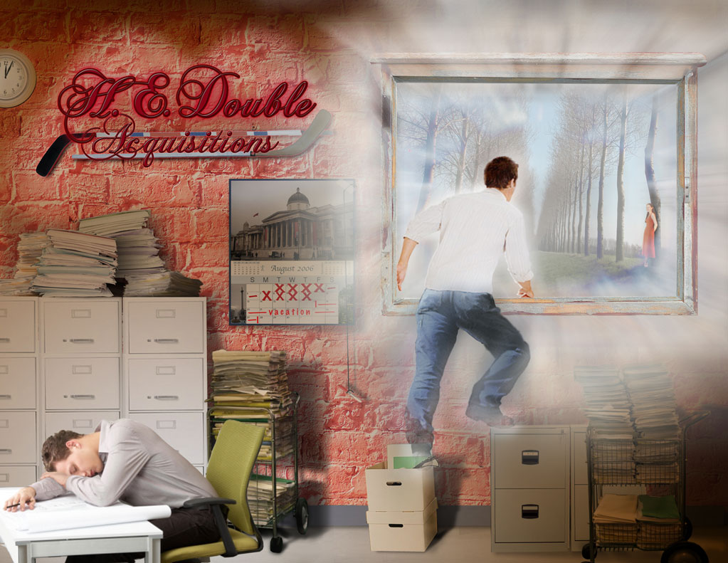
Back a few months ago when I was trying to figure out what to do with Photoshop, keep it or sell it (after all, why keep a tool around if you never use it?). Saw a magazine on a news stand that caught my attnetion. Issue #5 of Photoshop Creative featured a sketch tutorial that intrigued me, so I bought the magazine.

In each magazine, they have a section entitled 'Readers' Challenge' where they supply a few stock photos for the reader to make anything they want to from and then send it in to the mag for the chance to win a Photoshop plug-in.

The result of that Challenge was Dragon Season, from issue #6 came 'Penguin Postcard' and from issue #7 came 'Dream Vacation'.

What I noticed after mailing them off, was the ever decreasing quality between them. With the first, stayed with it until it looked right, the way I wanted it to. The next, I got a little impatient with getting the right finish on it. Was aiming for a Monet tie-in, as that was the featured tutorial that issue, but lacking a graphics tablet, gave up (couldn't manage all those brush strokes with a mouse) appling a texture instead. It's okay... but some subjects are watercolor, others photorealistic (for lack of a better term) The one thing I am satisfied with it, was using the Cracked Rock photo for the distressed appearance.. couldn't figure out how anyone would possibly use that in a photo... And in #7's, just completely frustrated with the inability to get the lighting right.

Thinking back to the first, I didn't settle for what I could do, instead... figured it out! Tried tons of things, some worked, some... most... didn't. Went back in the history palette several times to undo something not quite right... I just didn't take the time with the others as I should've, increasingly relied more heavily on other sources to tell me how, instead of adapting what was avaiable to what I needed.

Anyway, check the links to the right for the entries.

Photoshop InDepth Challenge Mural entry


The challenge was to go to stockxchng.com and do a randomized search, and add whatever image returned from that search to what's gone before. The image # that came up for me was 191536_8219 ... if you go to stockxchng and enter that number in the search field it will bring up the original. Below is the link to view the mural thus far. (I was pretty nervous, because these guys, and gals, are very good!)

http://photoshop-indepth.com/challenge/challenge-complete.jpg

Tuesday, May 09, 2006

Weekly_Challenge_thingie_#1


This challenge was two images, one of a rose, another of bubble wrap

Monday, May 08, 2006

'False Hope'


For the Weekly Challenge #2

For this challenge one a picture of a construction cone, the other of a steaming gyser.

Back to the drawing board

There's this commercial running locally where a guy just finishes attaching a wall plate to a light switch. He flips the switch on and the doorbell rings. Puzzled look, he flips it off and the doorbell rings again. He opens the front door and pushes the doorbell and hears a whirrring sound behind him. Walking into the hall sees the ceiling fan running, turns it off and that, in turn, turns on the tv. Turning the tv off, again a distant noise... enters the kitchen to see the garbage disposal spewing a fountain into the sink... racing over to turn it off, sees the garage door open as a result... runs to the garage and pushes the button, breathing a sigh of relief that he'd reached the end of the chaos...only to have the automatic sprinklers come on and shower his wife who's working in the garden...

Okay, so yesterday, when I was doing a search for backlighting text, came across a tutorial from Photoshop InDepth that involved the physics of light and how it interacts with objects/surfaces... Well, when I took a look at that and some of the other tutorials on the site, I realized instead of trying to go in and adjust the shadows... tweaking it here or there... I really need to start over, as it were. Go back to the Dream Vacation's .psd file and hide every layer but the wall and floor layer, get the lighting right, then add one element after another tweaking the light/shadow as each interact in the enviroment until it's complete. Like the commercial, there are just so many things wrong that interconnect, that I have to go back to the very start and fix it as I go.

Hopefully in that time, I'll have a solution for the dream sequence as well.

Sunday, May 07, 2006

Dream Vacation issue 7 entry


This is one of those challenges that I'm going to have to revisit because I'm so new, relatively speaking, to advanced techniques, that there's just so much in this image that bugs me... still, no excuse. These are things I didn't wait to find the proper solution to.

I'm not completely satisfied with the back-lighting on the corporate sign, or how the light and cast shadows interact. The other thing that I'm not completely happy with is the dream transition. It should be more ethereal... dream like. I think I just grew too impatient, wanting to get this, with the other entries, in the mail... and just settled for 'good enough'.

For instance, the light from the corporate sign should better 'show' the texture of the wall it's reflecting off of. I suppose I could've accomplished this with texture map... didn't realize that at the time... learning as I go. The light should be brighter, crisper, the closer it is to the source (behind the lettering) but as is, is flat... like the reflected light on the wall.

Readers' Challenge CD Cover


This is a composite of many pieces... but... I suppose... that's what composite means... I'll get a hang of this blog thing eventually... bear with... The original image stopped just beyond the doorbell on the left, had a different door... Anyway, was just a way of illustrating the 'open door' nature of the Readers' Challenge featured in Photoshop Creative.

With this, and the Challenge entries submitted, I came to realize that there's a whole lot to learn about proportion, light, shadow, reflected light, and all just to give a 'natural' feel. It's amazing what you don't notice when things are 'right' but if a shadow is mis-cast or a handle is out of proportion, catches the eye right off.

Comments welcome.

Venturing into the water

I don't consider myself an artist, designer... much of anything, but when given a challenge of one sort or another, try and find a solution to it. Whether that's building an enterainment center to balance an area of visually disproportionate elements, or making something out of something else with Photoshop... it's looking for, and finding, the answer to a challenge.

Now, when you look at the results I've achieved, realize I am not gifted in any of these areas. This work is as challenging as finding the solution. There are better carpenters, better designers, better artists... I'm just showing what solutions I've found to the challenges given. The satisfaction is equal in finding and accomplishing the solution... yet, when considered as a whole it borders on the indescribable.