Dream Vacation issue 7 entry
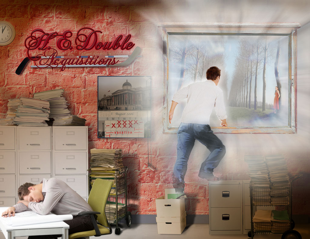
This is one of those challenges that I'm going to have to revisit because I'm so new, relatively speaking, to advanced techniques, that there's just so much in this image that bugs me... still, no excuse. These are things I didn't wait to find the proper solution to.
I'm not completely satisfied with the back-lighting on the corporate sign, or how the light and cast shadows interact. The other thing that I'm not completely happy with is the dream transition. It should be more ethereal... dream like. I think I just grew too impatient, wanting to get this, with the other entries, in the mail... and just settled for 'good enough'.
For instance, the light from the corporate sign should better 'show' the texture of the wall it's reflecting off of. I suppose I could've accomplished this with texture map... didn't realize that at the time... learning as I go. The light should be brighter, crisper, the closer it is to the source (behind the lettering) but as is, is flat... like the reflected light on the wall.
posted by gsmith_119 at 1:58 PM
![]()

0 Comments:
Post a Comment
<< Home